Asian fusion cuisine is an emerging variant of food here in the Philippines, but it’s also quite tricky as not everyone can successfully pull it off. Feast and Fire aims to do just that, while drawing on Filipino traits of warmth and a strong emphasis on friendships. To achieve this, they collaborated with House of Hidaki to bring their flavors visually.
The name itself is derived from the aforementioned Filipino love for festivities and the warmth they bring to every gathering. Regarding visuals, their goal was to convey a clean, Oriental or East Asian vibe. Kevin Santos of House of Hidaki explains the mark as follows:
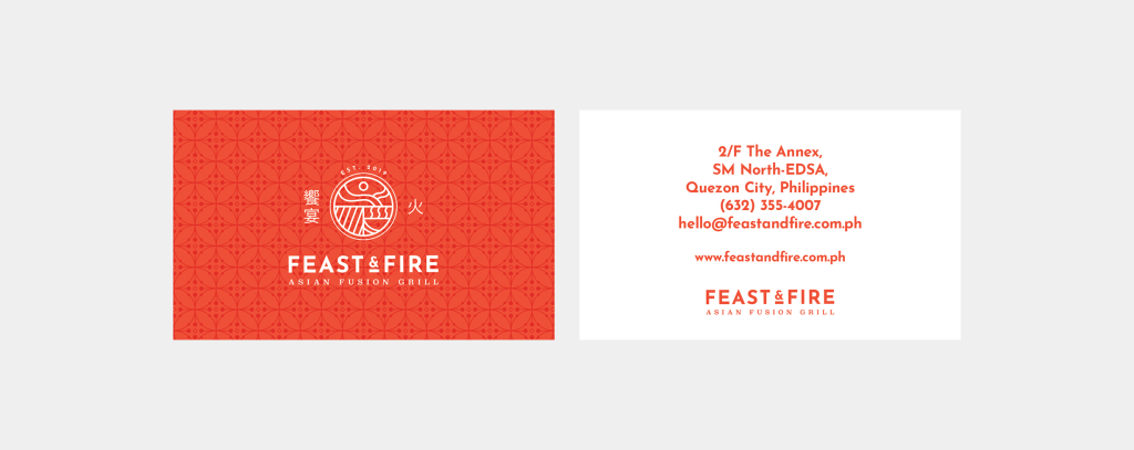
The diagonal lines in the lower-left part symbolize the grill where everything begins. Moving to the lower right, you’ll notice a bowl that symbolizes a warm, hearty meal and the satisfaction of being full. The upper half represents a blend of elements: the mountains symbolize freshness and spices, the sun signifies the life it brings, and the overlapping lines of two mountains emulate the raised hands of a joyful person savoring a great feast.
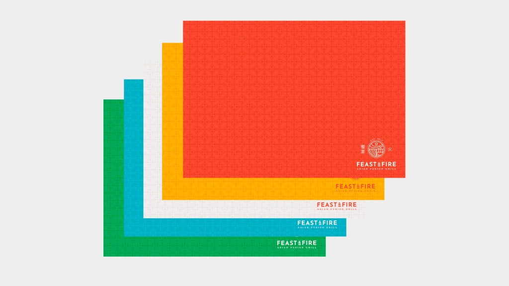
The colors have been carefully chosen to capture the essence of feasting and abundance, featuring warm palettes that undoubtedly appeal to the palate. The patterns are also cleverly derived from elements found in the logo itself.


Brand Identity, Design, & Illustration: Kevin Paul Santos, House of Hidaki.
Copywriting & Naming: Grace Muncada
Interior Design: Kathyrine Co
Food Photography: Hannah Heramis

Leave a comment