Scent is a powerful tool for the human psyche. It unlocks memories, good or bad, and takes us on a journey. We would like to think that most of us started from the Angel’s Breath, Bench sprays, and Joel Cruz’ Afficionado, but now we already have a subculture of frag heads who would boast of international brands or of hyped-up local ones.
Enter Episode, another player in the scent game, with visual and brand identity done by the young but skilled Agape Design Studio headed by Paolo Salgado and Gela Muñoz.


From Agape:
For the Episode team, their purpose was to break the standard in the local fragrance industry where a brand can only succeed if they offer “dupes” or “clones” of pre-existing fragrances. With their expertise in fragrance, they were confident that they can create original fragrances that are at par with designer fragrances but at a fraction of the cost.
Aside from their purpose, they already had a name in mind: Episode, which is inspired by the concept that life’s moments are a series of episodes.

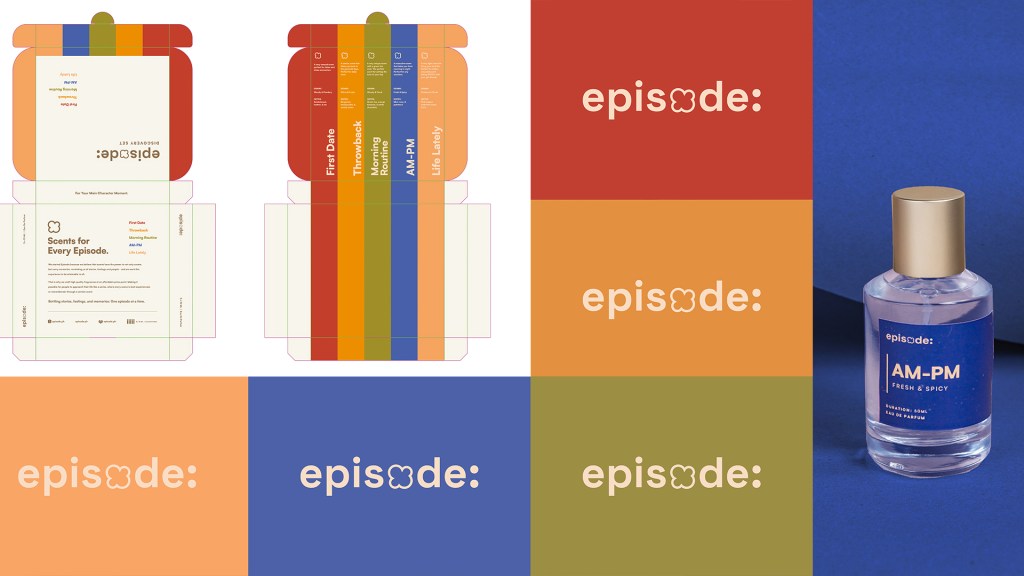
Agape’s notes on design:
LOGO: We created different approaches for the logo and initially wanted to only have a straightforward sans serif logo, but everyone in our team and the clients unanimously voted on this study which we now call the “popcorn” logo. This was a playful way to connect the logo to the episode theme while having a simple yet memorable icon that can also help with brand recall.
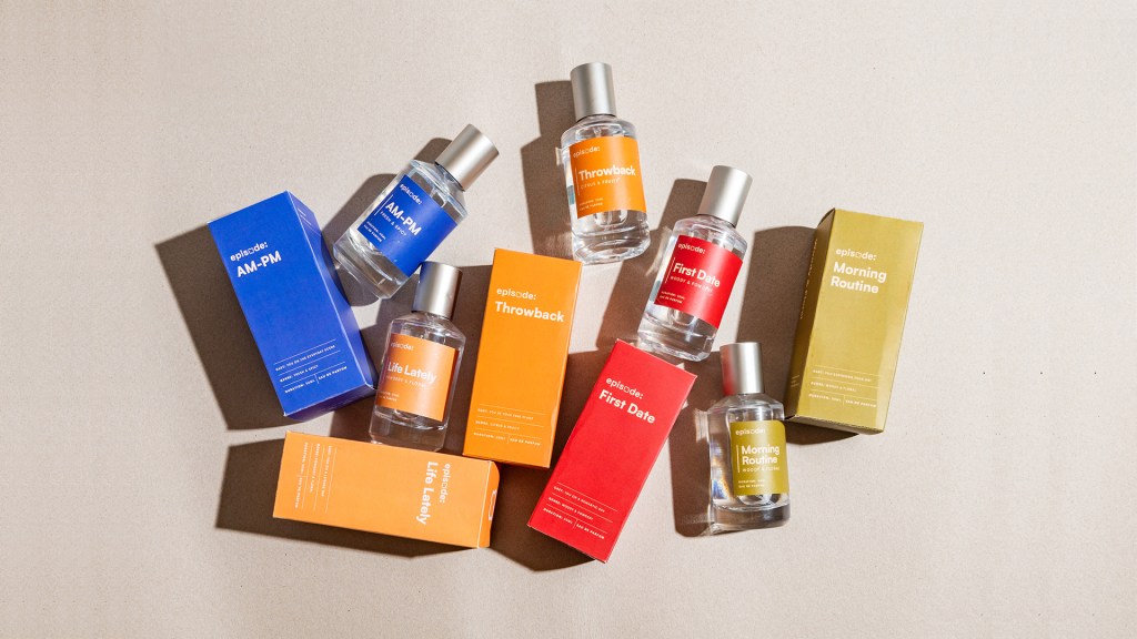
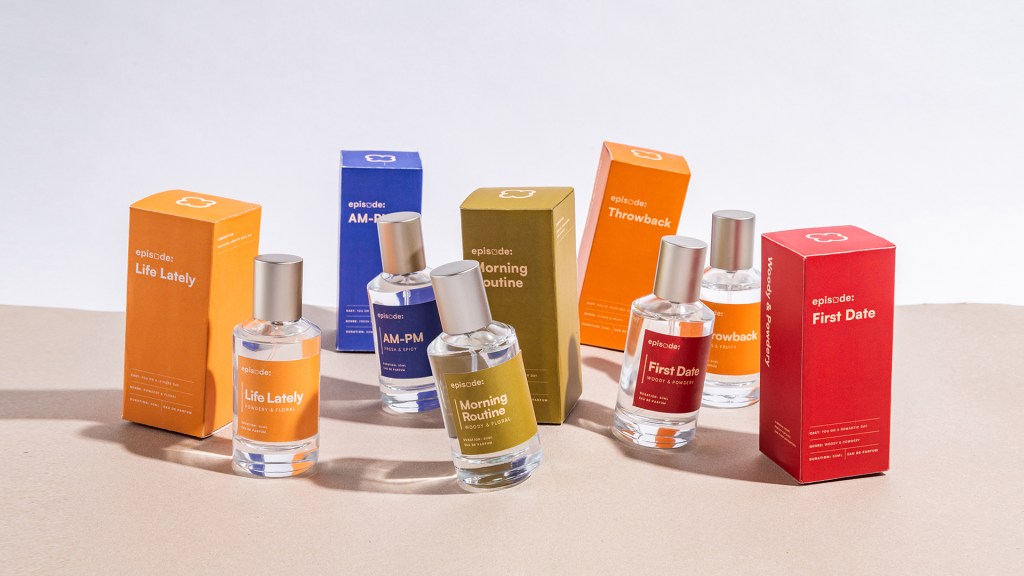
COLORS: The color palette will have a combination of colors with a vintage tone, the typography will feature a friendly sans serif font, and the logo will be a simple wordmark with a slight customization.
PACKAGING: Our approach to the packaging is to design it as a “season” with each scent or “episode” complementing one another visually. The goal was to create a collectability aspect and encourage people to buy all the scents.
With this in mind, a lot of importance was was put into the choice of colors, with it being the centerpiece of the visual identity. Our goal was to ensure that all the colors looked great together while still representing the personality of each individual scent.
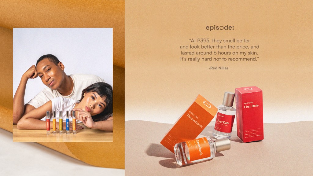
Agape even helped in the naming convention: With naming the scents, we wanted each one to represent its own “episode”, capturing a particular mood or vibe that wearers can envision themselves in. For example, for First Date, we envisioned being in a romantic night out, getting dressed up and sipping red wine, For Morning Routine, we envisioned waking up early, a cup of tea in hand, about to start our morning workout.

Here’s to having Episode’s brand identity as an inspiration for good product branding that brings back good flashbacks when we remember it.
In case you became interested with the product, check Episode’s official IG page. To follow more on Agape’s love for design, check them out here.

Leave a comment