Agriculture and food security are two issues faced by our country today despite originally dubbed as an agricultural country, being rich with natural resources. We have been a powerhouse of agricultural export like rice and saw a decline over the years.
However, things are slowly changing again for good as more and more Filipino entrepreneurs are seeing the value of going back the fields, literally, with more efforts on agri-ventures, such as this one, The Golden Sun Farm, with the playful visual identity done by Gian Wong.
As intro:
I am Gian Wong, born in Pampanga and currently living in Manila. Back in 2016, I started my career w/ a distinct inclination towards hand-lettering, calligraphy, and graphic design. I now work as a Content Creative Lead at a tech company, and I also moonlight as a freelance designer focusing on type-based visuals. I like to fuse strong type, expressive lettering, and rich color together to convey stories and messages.
From Gian:
One of the large-scale projects I worked on was the visual identity and packaging system for The Golden Sun Farm. It is a family farm based in Amadeo and Tres Cruses, Cavite, Philippines. They grow fruits and vegetables, as well as meat and poultry products. From their own produce, they craft freshly squeezed juices and other pantry staples for online retail.

About the Logo
To start off with the brand discovery phase, I engaged with the client through a concise brand questionnaire form. The intent is to gather key points about the brand and talk through the answers after submission.
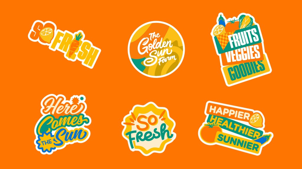
From this, I focused on two important aspects: (1) The items are crafted by hand and in-house using selected produce from the farm and (2) the farm is recognizable through its gold-colored gate, a special motif favored by the client. With that, I made a hand-lettered logotype in solid gold to capture those features.
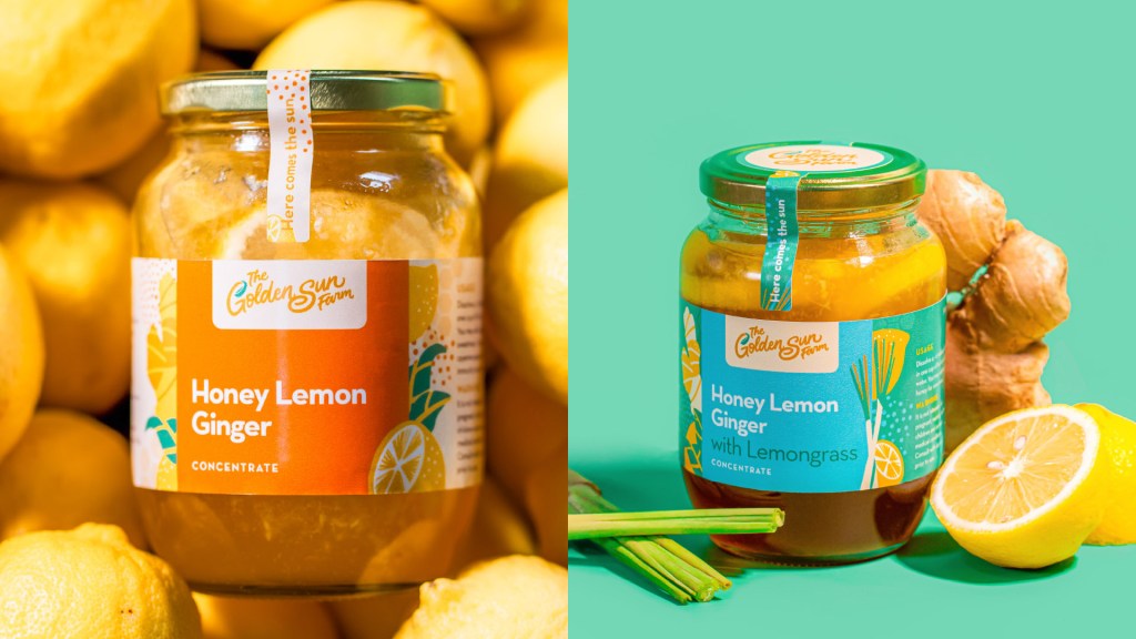
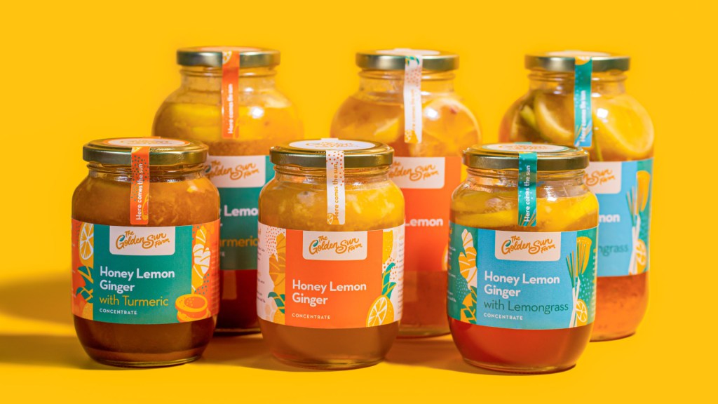
llustrations and Labels
The label designs I created take from a set of illustrations that include vegetables, fruits, and other food based on the brand’s raw materials. This system makes it easy to put together different iterations of product packaging while maintaining differentiation across the variants.
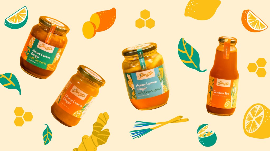
With a simple block-style layout, developing new products would not be difficult since the brand is still starting out.
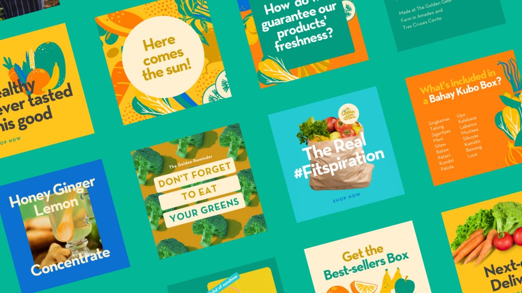
The different touchpoints of the brand such as swag and social media templates feature fun, colorful layouts to bring a sense of delight just as you interact with the brand. The system for these minor touchpoints are much more loose and experimental to showcase the fun, imperfect, and fresh aspect of the brand’s products.Overall, the goal is for the experience to be light and memorable just like the different products they offer.
Here’s to being excited to see how this brand would continue to develop, along with the progress in agriculture again here in the Philippines.
—
Brand Identity by Gian Wong.
Follow him in other places too:
Instagram: @giancarlowong

Leave a comment